OUR EARLY DESIGN
What gendhengs want for the GUI is a design which is match up with the KLIA transit overall design, but in a way it suppose to be good for children also. So far what we see from KLIA services they put clean, simple, ethnic, and futuristic design. Which is have color scheme mostly in white, purple, and Tosca. Meanwhile, we thinking about our target consumer that will be a child, so our design is have to be cute, eye catching, and understandable. We thinking about soft-vivid and colorful design.
after a long brainstorming about our appearance and GUI, we came out with the simple but smart design that suitable for our application.
This is one of our reference for the GUI. We take this from www.2ddepot.com
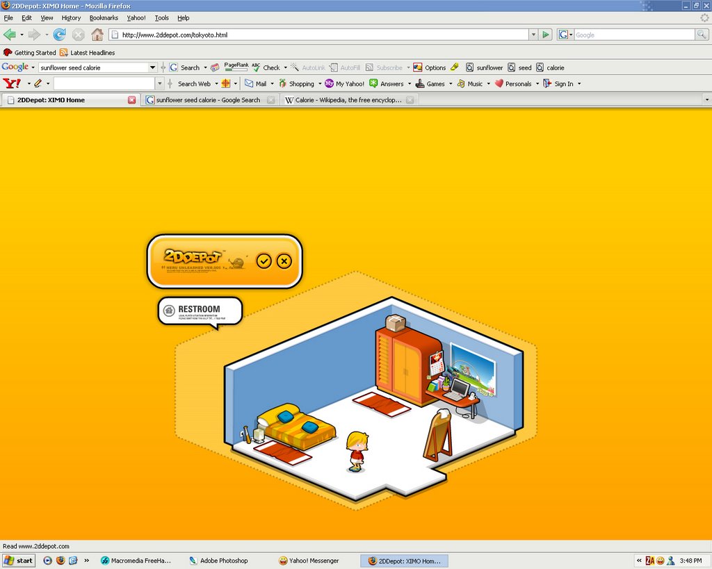
in this design there will be a character that played around the stage. this design can be so interactive because the kids can click and choose several stuff to get the information or to go to another stage.
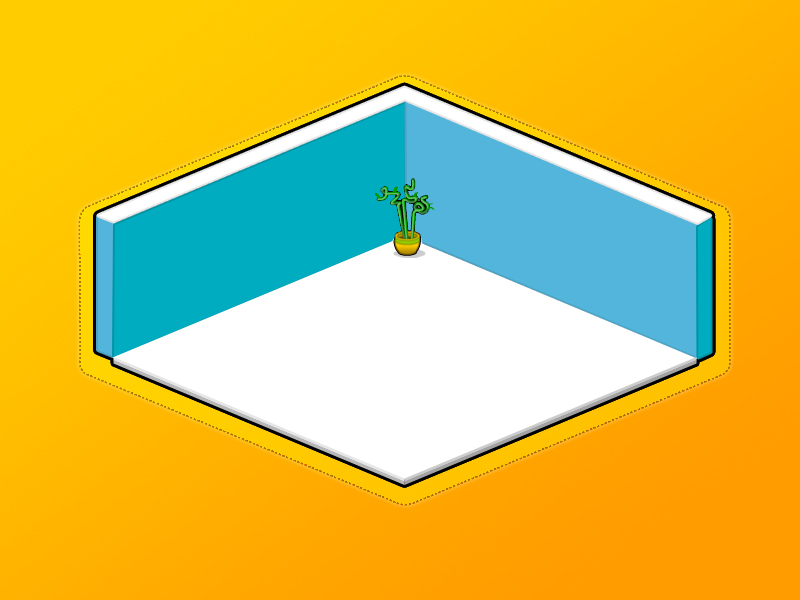
from this reference we came out with some early design
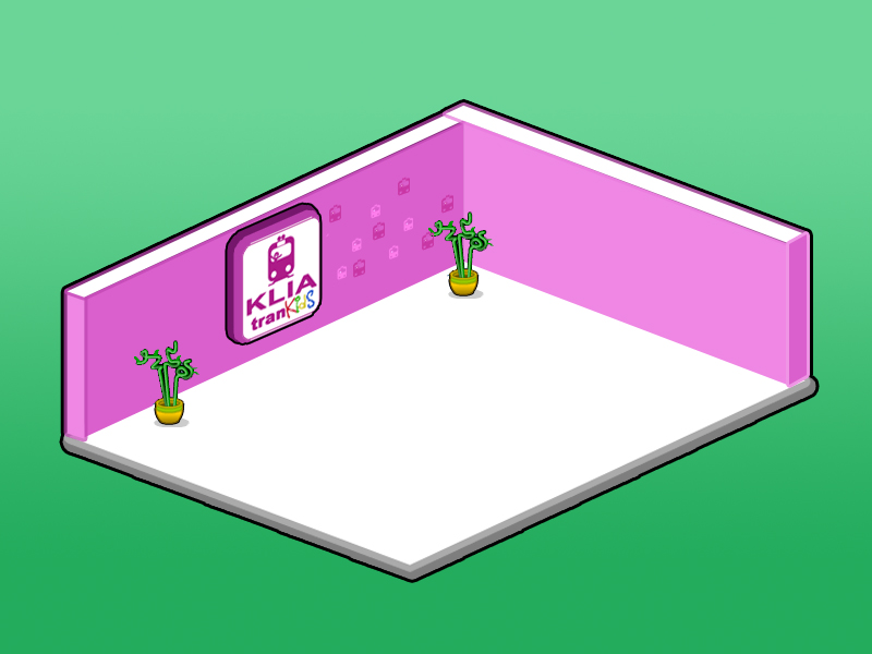
this design was made by Reza.
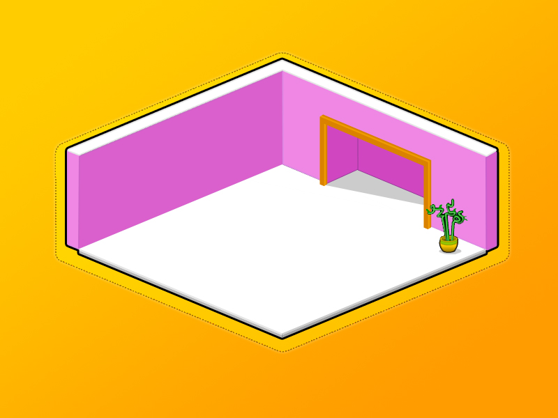
 and this one by Gatya.
nothing extremely different but here I just change the background with brightness color and fix the slanting of the floor. later we will combine both of it.
Both of the design we can see the the changing of color scheme and environment. of course this early design not done yet. later we will make a complete KLIA station environment with all the counter and ticketing machine, and also the navigation panels for control and help button.
and also our early character design
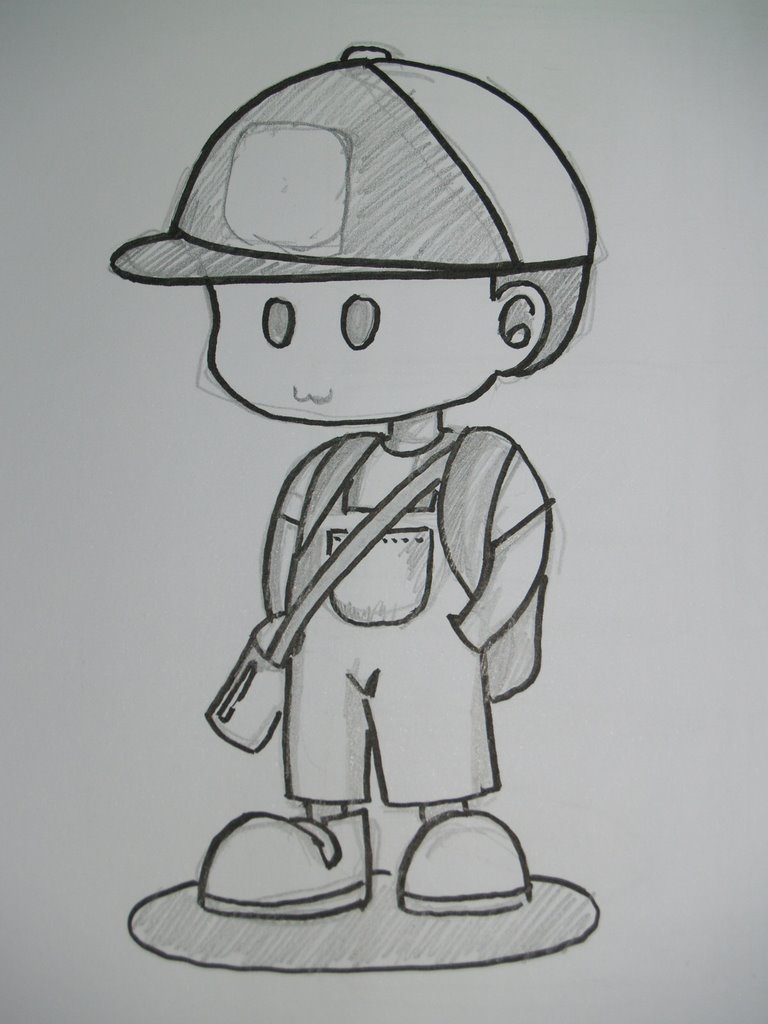 later we will make both boys and girls then animate them so they can moving around the station.
[gendheng#3. gatya]
posted by vaLerism™ at 7:16 PM
![]()

0 Comments:
Post a Comment
<< Home